What the Lab Consists of: |
 |  |
Calculating the FItness Score:
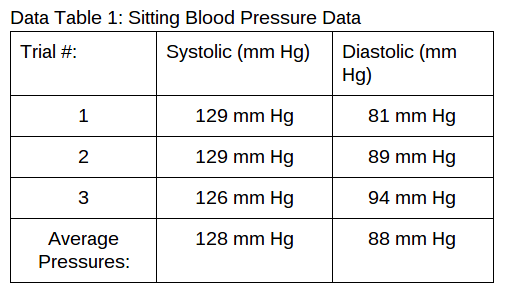
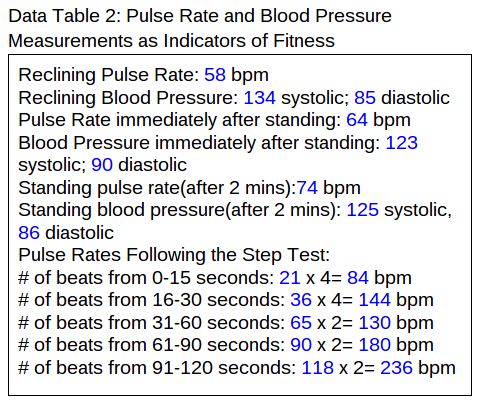
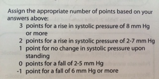
Calculate the difference between the standing and the reclining systolic blood pressures. 11 mm Hg
Systolic Pressure: Rise or Fall? Fall
Calculate the difference between the standing and the reclining systolic blood pressures. 11 mm Hg
Systolic Pressure: Rise or Fall? Fall
Conclusion:
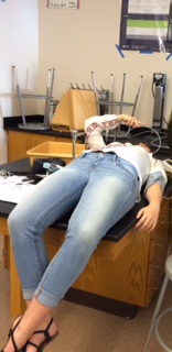
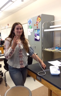
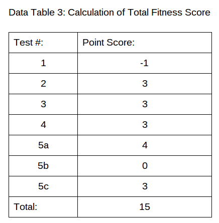
According to the index of cardiac fitness our test subject (Alyssa) has a good fitness score of 15. When we were measuring her blood pressure it took quite a long period of time. One of our sources of errors was when Alyssa was laying down she did not remain quiet and silent. She was talking which probably through off her difference between standing and reclining blood pressure. Therefore we had bad pulse rates and blood pressure readings in the beginning of the experiment due to the subject not remaining calm and quiet. As soon as the timer went off we had to immediately take her pulse rate then her blood pressure. As soon as she stood up we had to take her pulse rate and blood pressure too.
Some other sources of error could have been not giving yourself enough time to conduct the experiment, not taking the subject's pulse rate and blood pressure right away and not having the subject change their breathing for their fitness test. One huge source of error could have been not remaining calm and quiet while we took each other's blood pressure.
Activity 10C:The Influence of Temperature on Heart Rate
Hypothesis:
If you increase the temperature of the water then the Daphnia's heart rate will go up.
When conducting the experiment we will:
Steps in conducting Activity 10C:
Hypothesis:
If you increase the temperature of the water then the Daphnia's heart rate will go up.
When conducting the experiment we will:
- Observe the effect of temperature change on the heart rate of an invertebrate.
- Graph the relationship between heart rate and temperature in an invertebrate.
- Daphnia
- 1 mL Pipet
- Deep Well Slide
- Dish with room temperature water
- Dish with 10℃ water
- Dissecting Microscope
- Thermometer
Steps in conducting Activity 10C:
- Cut the tip off of the plastic 1 mL pipet so that the opening is large enough to draw in one Daphnia.
- Draw up the Daphnia and place it into the well side of the deep well slide with 2 drops of culture fluid.
- place the cover on the slide, examine the daphnia under the microscope.
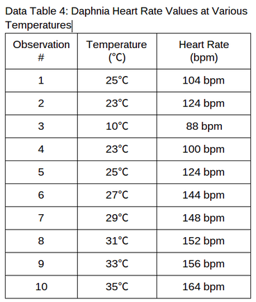
- Count the number of heartbeats you observe in 15 seconds. Multiply it by 4 to get the beats per minute. Record the number in Data Table 4.
- Use the thermometer to get the temperature of the culture fluid. Record the temperature in Data Table 4.
- Submerge the deep well slide of Daphnia in a petri dish containing 10℃ water. Observe the Daphnia's heart rate for 15 seconds. Multiply the number by 4 to get the beats per minute. Record the amount in Data Table 4.
- Use the thermometer to get the temperature of the water around the slide and record it in Data Table 4.
- Pour warm water into the dish, for every increase of 2℃ record the Daphnia's heart rate for 15 seconds, then convert it to bpm and record it in Data Table 4.
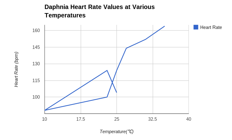
Graph Justification: When creating a graph for the Daphnia I needed one that would prove a change in temperature at different heart rates which means a change over time. Therefore I chose a line graph because it allowed me to create a graph that proved my data.
Conclusion: During this experiment we can see that there was a huge plunge in the Daphnia's heart rate when we moved the Daphnia from room temperature water to ice cold water. Once the temperature increased so did the Daphnia's heart rate. Therefore our hypothesis was correct because when there was an increase of temperature there was an increase in their heart rate. Some sources of errors that could have taken place was that if the daphnia died before conducting the experiment, also if the water was not war enough or the water temperature didn't change at all. Another source of error could have been not giving yourself enough time to conduct the experiment.
Conclusion: During this experiment we can see that there was a huge plunge in the Daphnia's heart rate when we moved the Daphnia from room temperature water to ice cold water. Once the temperature increased so did the Daphnia's heart rate. Therefore our hypothesis was correct because when there was an increase of temperature there was an increase in their heart rate. Some sources of errors that could have taken place was that if the daphnia died before conducting the experiment, also if the water was not war enough or the water temperature didn't change at all. Another source of error could have been not giving yourself enough time to conduct the experiment.
Answers for questions for 10A-10C:
- Some possible damaging effects on the body due to chronic hypertension might be cardio vascular damage and it makes your body grow weaker.
- Blood pressure is normally lower when a person is reclining than standing because when you are standing you are moving around which is making your blood circulate more frequently but when you are laying down you are not moving which means the blood pumps slower in the body because it doesn't needed to be circulated more often because you aren't doing anything.
- The baroreceptor reflex is one of the body's homeostatic mechanisms that helps maintain blood pressure at nearly constant levels. It is important because it keeps everything balanced in the body.
- The blood vessels get smaller in diameter due to cold temperatures because they don't want to lose any heat. They constrict to avoid heat loss in the vessel.
- If an ectotherm is hot it will find shade under a tree to regulate its body temperature from being too hot. If the ectotherm is too cold then it will lay under the sun on the ground or rocks to raise their body temperature due to the the warmness of the sun and ground/rock.
- Ectotherms take their body temperature from the environment around them which means if the temperature decreases them the metabolic rate decreases. Endotherms are warm blooded and don't take their body temperature from things around them which means the environment wouldn't mess with its metabolic rate.
Part 1:
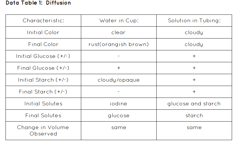
Explanation: In this lab we were testing osmosis and diffusion. We were testing if diffusion were to occur what would happen. Would the starch diffuse through the dialysis bag or would the starch. Or would both.
Hypothesis:If diffusion occurs during the experiment then there will be glucose in the water of the cup because of diffusion from a high to a low concentration.
Materials:
- Goggles
- 1 plastic cup
- 15 cm Soaked dialysis tubing
- 15 mL 15% Glucose/ 1% Starch solution in a medicine cup
- 1 plastic pipet
- 2 glucose test strips
- 2 10 m pieces of string
- iodine(starch indicator) solution
- Fill cup up with distilled water. Leave about 1-3 cm off the top of the cup
- Dip glucose test strip in water, 1-2 seconds. Remove any excess liquid
- Wait 2-3 minutes to observe any color change on the strip. A positive (+) glucose test is indicated by a greenish color on the test strip. No color change will occur if the test result is negative (-). Record on Data table 1
- Use a plastic pipet add 20-25 drops of the starch indicator solution (Iodine) to the water in the cup. Observe (take a picture) as it mixes with the water. Record the color of the water in Data table 1.
- Gently rub the tubing between your fingers to open it.
- Tie one end of the tubing tightly with a piece of string. Fill the tubing with water and test it for leaks at a sink then empty the tubing.
- Insert the funnel tip into the open end of the dialysis bag, and pour the 15 mL of 15% glucose/1% starch solution from the medicine cup into the tubing.
- Squeeze all the air bubbles out of the tubing and tie the open end shut with another piece of string. Note the color of the starch-glucose solution in the dialysis tubing and record in Data table 1.
- Rinse the outside of the bag under running water. Squeeze the bag gently to ensure that there are no leaks. Adjust the string if there are leaks.
- Completely submerge the model cell into the cup of water and starch indicator solution. Allow osmosis and diffusion to occur for 30 min.
- After 30 min test the water in the cup for sugar content as in Step 2. Note any color changes in the dialysis tubing and in the cup (take a picture). Record in Data table 1.
- Wash your hands and clean up your area.
| 
|
Data Table:
Conclusion:
In our lab it went pretty well. We saw diffusion in action. According to my hypothesis was correct; If diffusion occurs during the experiment then there will be glucose in the water of the cup because of diffusion from a high to a low concentration. Diffusion occurred when we put the starch and glucose dialysis bag into the water. When we first checked before we waited the 30 minutes there was no glucose present in the water. But after the 30 minutes was up there was glucose present. That is when diffusion happened. Glucose diffused into the water because it came from a high concentration to a low concentration.
Some things that were a struggle to us was the time management. We didn't really think it would have taken us a long time but we got done with the lab 5 minutes before our period was up. Also we didn't understand how to tie the string tightly so that took us a while too. Overall it was a successful experiment.
Analysis Questions:
1. What is simple diffusion according to the experiment performed?
Simple diffusion is the movement through a membrane from a high concentration to a low concentration.
2. What are 2 characteristics of substances that do not allow them to pass through the selectively permeable membrane of living cells?
The size and the charge of the substance do not allow them to pass through the selectively permeable membrane. If it is too large or there is a charge they will not allow them to pass through. Especially if the molecules are hydrophilic-it goes well with water.
3. What types of molecules more easily through living cell membranes?
Small molecules that don't have a charge move more easily through living cell membranes. Also hydrophobic molecules move more easily through a membrane. hydrophobic- does not react to water
4. Did the glucose molecules pass through the dialysis tubing? How do you know?
Yes the glucose did pass through the dialysis tubing because the test strip turned green therefore there was glucose molecules in the solution. When we first tested it the test strip did not test positive for glucose.
5. Did the starch molecules pass through the dialysis tubing? What evidence do you have to support this conclusion?
No because the solution with the iodine in it did not change to a blue color. Also the starch did not pass through because the solution did not change from the bronze color to the blue color.
6. Why did we use dialysis tubing as a model for a cell membrane?
Because it is also a semipermeable membrane. Therefore it only allows certain molecules to pass.
7.Why were the results for final starch and final glucose filled in already on Data table 1? (Hint: Would all of the solutes diffuse out of the dialysis bag? Why or why not?)
The results were already filled out on the chart because we knew that when diffusion occurs solutes move from a high to low concentration but they can't do that if they have too large of molecules.
Part 2:
Explanation: In this lab we looked at different amounts of sucrose solution in dialysis bags and weighed the initial mass and then waited a time period of 30 minutes and weighed the final mass.
Hypothesis: If 6 dialysis tubes were filled with different amounts of sucrose solution and placed in cups of water for 30 min, then after the time is up their mass will have increased due to osmosis.
Materials:
- Goggles
- 6 cups
- 6 15-cm dialysis tubing segments
- 12 10-cm string segments
- 1 Medicine cup, plastic
- 10 ml Distilled water
- 10 ml 0.2 M Sucrose Solution
- 10 mL 0.4 M Sucrose Solution
- 10 mL 0.6 M Sucrose Solution
- 10 mL 0.8 M Sucrose Solution
- 10 mL 1.0 M Sucrose Solution
- 1 marking pencil
- Tape
- Paper towel
Procedures:
- Gently rub each piece of tubing between your fingers to open it.
- Tie one end of the tubing tightly with a piece of string. Fill the tubing with water and test it for leaks at a sink and then empty the tubing.
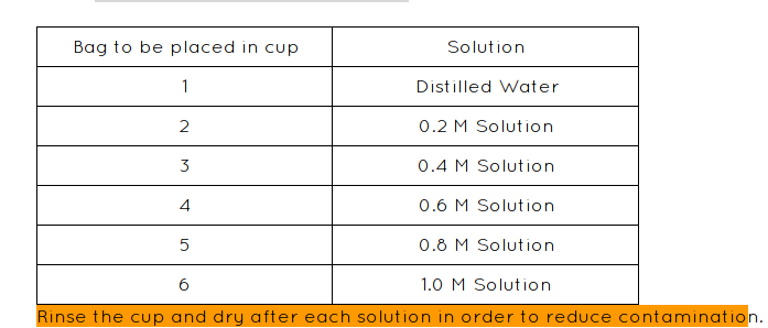
- Use the medicine cup to measure out 10 mL of the appropriate solution into the dialysis bag as follows:
- Rinse the outside of each bag under running water to remove excess sucrose solution present on the outside of the bag. Squeeze each bag gently to make sure there are no leaks. If there is a leak make sure you adjust the strings.
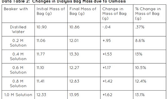
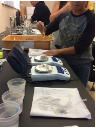
- Dry the outside of the bag with a paper towel and weigh the mass of each bag. Record in Data table 2.
- Place the appropriate dialysis bag into each of the numbered cups and fill each cup with enough distilled water to completely cover the bag. Begin recording the time. You need 30 min.
- After 30 min, remove each bag from its cup and gently blot excess moisture from the surface of each bag with a paper towel. Weigh the mass of each bag again. Record the final mass in Data table 2.
- Wash and clean up. Dispose of any waste materials.
- Calculate the change in mass for each bag. Record the information as accurately as possible.
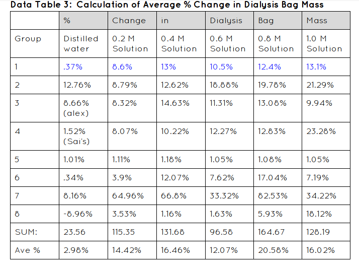
- Divide the change in mass calculated in Step 9 by the initial mass of the appropriate bag and multiply by 100. This is the percent change in mass for each bag.
- Calculate the class average percent mass of the bags in Data table 2.
- Construct a graph of the percent change in mass for the average values and their own group’s values.
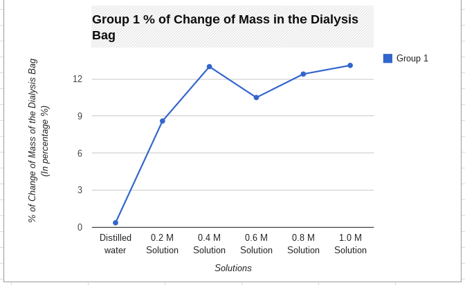
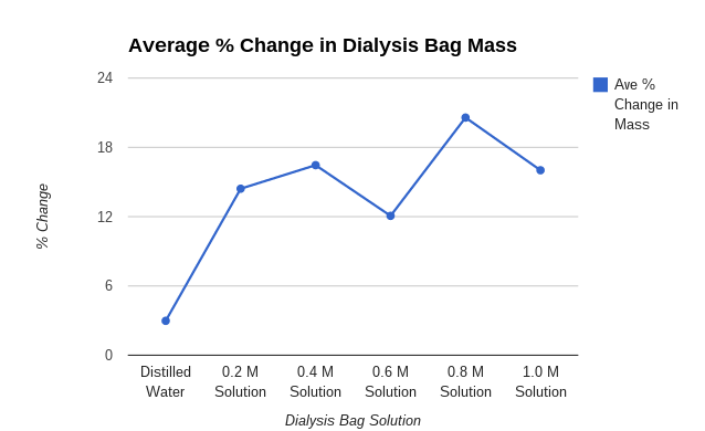
Graph:
Graph Justification:
I used a line graph because it worked with my data great. You can easily see the difference between the average and my group 1's data. You can tell that they are both accurate because they are in the same range. Using a line graph helps a lot because it helps you see the changes in data and it shows you if you were right or wrong with your data.
I used a line graph because it worked with my data great. You can easily see the difference between the average and my group 1's data. You can tell that they are both accurate because they are in the same range. Using a line graph helps a lot because it helps you see the changes in data and it shows you if you were right or wrong with your data.
| 
|
| 
|
Conclusion:
My hypothesis; If 6 dialysis tubes were filled with different amounts of sucrose solution and placed in cups of water for 30 min, then after the time is up their mass will have increased due to osmosis, was correct. It was correct because all of our bags' mass increased. None of them lost mass therefore we conducted a well put together lab.
In this experiment we conducted it very well but there were some struggles. We struggled with also time management and tying the dialysis bags. But overall it was a great experiment. When we first started we had a confusion but our teacher was super helpful and put us back in the right direction.
Analysis Questions:
1. What is osmosis according to the experiment performed? How does it differ from the diffusion we did in Part I?
According to the experiment performed, osmosis is the movement of water through a selectively permeable membrane from a region of higher concentration to a region of lower concentration. It differs from diffusion in the way that osmosis is only the movement of water molecules while diffusion is the movement of any molecules.
2. Did osmosis occur in each treatment? What observations led you to this conclusion?
Yes, osmosis occurred in each treatment. The observation that led me to this conclusion was the change in mass for each treatment, which means that the solutions went through the membrane and osmosis.
3. You observed a change in mass of the bags over the course of the experiment. Why was it important to convert the absolute change in mass of the bags to a percent change in mass of the bags?
Yes it is important to convert the mass of the bag into a percent because we would then be able to compare the different bags and keeps us from making any errors because we are dealing with a percent not over complicated numbers.
4. Did you see any clear relationship between the molarity of the solutions in the bags and the percent change in the mass of the bags? If so, how would you describe that relationship?
No I did not see a clear relationship between the molarity and the percent of change in the mass of the bags. The percent of change has to do with the weighing of the bag before and after osmosis occurred.
5. If you had placed all 6 bags into a beaker containing 1.2 M sucrose, would your results have different from what you observed? Why? Describe possible results for each of the bags placed in this solution.
Yes our results would have been different because our result would have turned out to be the complete same because we are putting the same sucrose solution inside them for the same amount of time. We would have no variation in the experiment.
Part 3:
Explanation: In this experiment we were testing the rate of diffusion and osmosis. We are weighing potato cores for their initial mass and then we are waiting for a time period of 24 hours too check the final mass to see if they were to lose of gain weight from the sucrose solution.
Hypothesis:If the potatoes are hypotonic to the solution then they will lose mass.
Materials:
Procedures:
Explanation: In this experiment we were testing the rate of diffusion and osmosis. We are weighing potato cores for their initial mass and then we are waiting for a time period of 24 hours too check the final mass to see if they were to lose of gain weight from the sucrose solution.
Hypothesis:If the potatoes are hypotonic to the solution then they will lose mass.
Materials:
- Goggles
- #2 Cork borer
- 1 potato
- 1 scalpel
- 1 cm ruler
- 6 plastic cups
- plastic wrap or foil
- pencil
- 100 mL Distilled water
- 100 mL 0.2 Sucrose solution
- 100 mL 0.4 Sucrose solution
- 100 mL 0.6 Sucrose solution
- 100 mL 0.8 Sucrose solution
- 100 mL 1.0 Sucrose solution
- Paper towel
- Balance
Procedures:
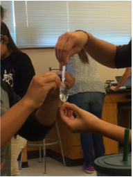
- Push the cork borer completely through the potato. Remove the potato core from the borer. Carefully cut off each end of the core where the potato skin is.
- Lay the core next to a metric ruler. Measure and cut a 3 cm long potato core section.
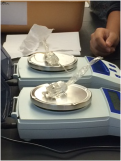
- Punch a total of 4 potato cores, each 3 cm in length. Obtain the mass of the 4 cores together to the nearest 0.1 g. Keep cores covered until you are able to weight them.
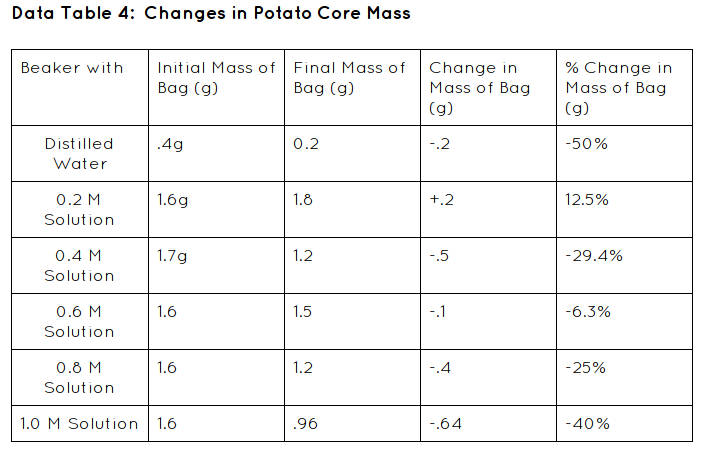
- Place 4 cores into one of the labeled plastic cups containing a solution. Record the initial mass of the 4 cores for this solution in Data table 4.
- Repeat steps 1-5 with each of the remaining cups. Cover all of the cups with plastic wrap or foil to keep evaporation to a minimum.
- Place the cups in your tray so that they will not be disturbed overnight.
- Remove the cores from one of the cups and carefully place them on a paper towel. Dab the cores with the paper towel to dry them. Obtain the mass of the 4 cores together. Record in Data table 4.
- Repeat step 7 for each of the cups.
- For each of te solutions, subtract the initial mass of the cores from the final mass of the cores to obtain the change in mass. Be sure to record a positive result if the cores gained mass and a negative result if the cores lost mass. Record these calculations in Data Table 4.
- For each solution, calculate the percent change in mass for the cores as you did for the dialysis bags in the previous exercise. Record.
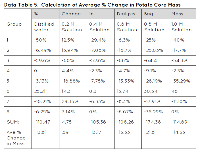
- Calculate the class average percent change in mass of the cores in each solution in Data table 5.
- Construct a graph of the percent change in mass for both your group’s data and the combined class averages.
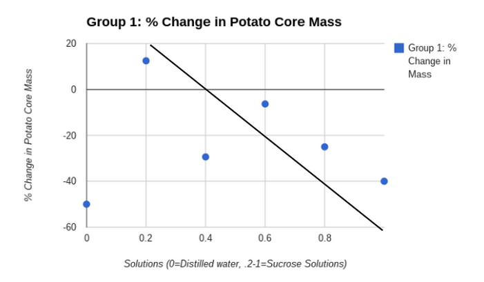
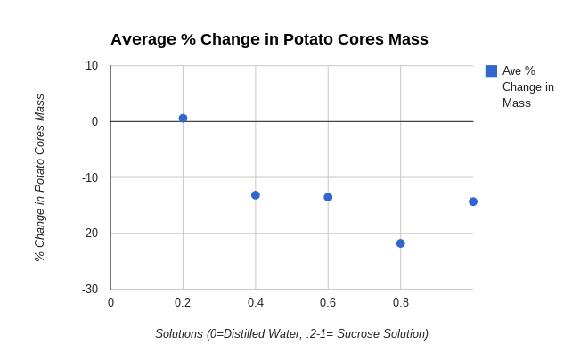
- Draw a “best fit” line corresponding to the points on your graph. The point at which your line crosses zero on the Y-axis is an approximation of the molar concentration of solutes inside the potato tuber cells. This point identifies the molarity of a sucrose solution that has the same water potential as that of the potato tuber cells.
Graphs:
Graph Justification:
I used a scattered plot graph because the data was easily seen, it also organized my data very well. The data was easy to compare to my other scattered plot graph and we could create a line of best fit to the points. The line of best fit was needed in our analysis questions so that is another reason that we needed to have a scattered plot graph.
Conclusion:
In my lab my data was supported. The initial mass decreased over the time period of 24 hours because the weight of the potato cores all mostly lost weight except for one in the .2 sucrose solution. Therefore my hypothesis was not correct; If the potatoes are hypotonic to the solution then they will lose mass, because not all of my potato cores lost weight.
Some errors in my lab might have been because we didn't put the potato cores in the solutions all at the same time so it might have messed up my data a little bit. Another error might have been when another group dumped their solutions out by mistake so we gave them some of our sucrose solutions so they could conduct their experiment. It probably messed with our data because we needed all the solution and we didn't have any. Another data that could have messed with my data was not fully covering the potatoes. It could have lead to an error of the solution and the potatoes soaking up the solution.
Analysis Questions:
1. Calculate the solute potential for the sucrose solution.
.5 M
2. Calculate the Potato tuber cell water potential.
-12.38 bars
3. Why was it necessary to keep the potato tuber cores in a covered container until the balance was available? If you had left them out in the open, how might that have affected your results?
It was necessary to cover the container because the water would eventually start to evaporate. If the water evaporated the concentration would become greater because there would be the same amount of solute but less solvent. It would then mess up our lab because this would cause more water to diffuse into the potato cores.
4. Some plants grow in salt marshes, where the concentration of solutes in the soil water is high. What is one adaptation you might expect to find in these salt-tolerant plants with respect to the solute concentration within their cells?
One adaption we might find is that they have a high solute concentration. If they didn't have this adaption then they wouldn't be able to survive because the salty water would absorb all the water and it would result in the plants dying because they wouldn't be getting any oxygen and nutrients from the water. They are able to take on all of the salt water because they have cells that already have enough salt because they have a high solute concentrations so they take in the water because it is more needed.
5. Water is usually “pulled” through a plant, from roots to leaves. What happens at the leaves to cause this “pull”? How would you describe the water potential at the leaf versus the water potential at the root? Why?
To cause this pull transpiration needs to occur. It causes the stomata (pores on the leaves surfaces) to breathe in the carbon dioxide and (water) and to release the oxygen through the process. At the leaves water gets evaporated and it causes a pull towards the leaves in order to fill the holes where the evaporated water was. At the root the water is sucked in due to water potential. It determines the movement and direction of water. It is going to move from a higher water potential to a lower water potential.
By: Haley DeLeon, Alyssa Cantrell and McKenzie Schumacher
In this photosynthesis lab experiment we tested the rate of photosynthesis. We tested different variables to see if they could change the rate of photosynthesis. If you add more drops of the dilute soap solution to the bicarbonate solution then the rate of photosynthesis will occur slower.
In the experiment we had to sink the leaves' disks in the solution so that they do not contain any more oxygen so that they don't float. This is why we conduct the vacuum so that we can extract all of the oxygen from them so that when we perform the lab the light will allow the disk to produce sugars and oxygen through photosynthesis so that the leaves will begin to float to the top. How ever long it takes the leaves to float that is the rate of photosynthesis.
The Materials needed are:
Procedures:
In the experiment we had to sink the leaves' disks in the solution so that they do not contain any more oxygen so that they don't float. This is why we conduct the vacuum so that we can extract all of the oxygen from them so that when we perform the lab the light will allow the disk to produce sugars and oxygen through photosynthesis so that the leaves will begin to float to the top. How ever long it takes the leaves to float that is the rate of photosynthesis.
The Materials needed are:
- hole punch
- 3 leaves
- syringe
- 2 beakers
- Sodium Bicarbonate Solution
- Water
- Dish Soap
- pipettes
- watch glass
- sun
- grow station
Procedures:
- Get 10 leaf disks by punching holes in the same leaf
- Put the 10 leaf disks into the syringe with solution of sodium bicarbonate and a drop of soap solution into the syringe.
- Replace the plunger and push out most of the air, but do not crush your leaves.
- Create a vacuum by covering the tip of the syringe with your finger. Draw back on the plunger.
- Release the vacuum so that the solution will enter the disks. It may take a few times to get the disks to sink.
- Once they have sank, you can put them back into the sodium bicarbonate solution and expose the disks to light
- Place another set of disks into a control beaker that contains only water.
- Record the number of disks floating at the end of each minute, swirl the disks to dislodge any that may get stuck to the beaker or to each other. The experiment should continue until all of the disks are floating.
- Repeat for 2 variable groups and 1 control group.
| Data Table: 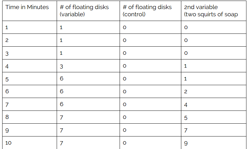 Graph: 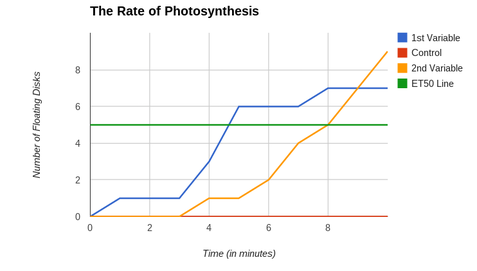 Graph Justification: The reason we chose to use a line graph is because we wanted to see the rate of change for the disks of leaves and we wanted to see it at a specific time. Therefore we chose to use a line graph because we can now compare the rate of photosynthesis at a specific time for all of the variables. By this graph we can tell when the rate of photosynthesis occurred and how long it took for the disks to float. The estimated time for 50% of the leaves to be floating for the first variable is 4 minutes and 30 seconds. The estimated time for 50% of the leaves to be floating for the second variable is at 8 minutes. Conclusion: Our hypothesis If you add more drops of the dilute soap solution to the bicarbonate solution Then the rate of photosynthesis will occur slower was correct because in our first variable we we only added 1 squirt of the solution and the rate of photosynthesis happened at 1 minute. When we added a second squirt of solution for our second variable the rate of photosynthesis happened at 3 minutes. Therefore the rate of photosynthesis occurred slower when we added more drops of solution. The estimated time for 50% of the leaves to be floating for the first variable is 4 minutes and 30 seconds. The estimated time for 50% of the leaves to be floating for the second variable is at 8 minutes. With the first variable at 10 minutes we had 7 leaves floating. With the second variable at 10 minutes we had 9 leaves floating. Some of the errors we were faced with in conducting this experiment was it took a lot of time to punch the holes out of the leaves. The temperature outside could have effected it too because we had to do our experiments on different days. We also had a teacher error because she left the solutions to sit too long overnight so it could have messed with our data. What can be improved is the amount of time we have to do it and having the leaves as a control because some people didn't even know what type of leaves they were playing. Also maybe teaching us what the questions mean before answering them would help us conduct the experiments better. Analysis Questions: Which solution, water or baking soda solution, caused the disks to rise the fastest? Why? The baking soda caused the disks to rise the fastest because the bicarbonate solution serves as carbon sources for the photosynthesis taking place. Since it serves as carbon the leaves will start to float because it is releasing oxygen into the leaves which will them cause them to float. Water does nothing to leaf because no chemical reactions take place because it is not releasing energy and carbon which will make the leaf float. How is photosynthesis an essential process for life? Photosynthesis is an essential process for life because it helps the plants get energy from the sun and transform it into food so that they can live and survive. When comparing the ET50 across treatments describe the relationship between ET50 and the rate of photosynthesis. The ET50 for the first variable was 4 minutes and 30 seconds. The ET50 for the second variable was at 8 minutes. The rate of photosynthesis for the first variable was 1 minute and the rate of photosynthesis for the second variable was at 4 minutes. As the rate of photosynthesis goes up the ET50 goes down. Therefore as more disks begin to float the time it takes for 50 percent of them to float decreases. As more of them start to float it takes less time to get 50 percent of them to float. | |
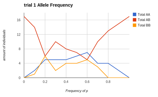
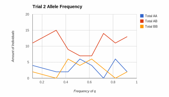
Changing of Allele Frequencies
by Haley DeLeon
Period 1
AP Bio
In our lab investigation we will be trying out different starting allele frequencies in our model. Therefore we will be changing the allele frequencies and seeing what the results are. If the allele frequencies change when the p value decreases and the q value increases then the frequencies will start to increase then they will decrease dramatically.
Materials Needed to Conduct Lab:
1. Lab Sheet
2. google spreadsheet
3. calculator
4. hardy weinberg equation
5. punnett square
Procedures:
1. We need to build a lab spreadsheet that will model how allele frequencies change through one life cycle of this imaginary population.
How to make a lab spreadsheet:
(1. In Google Drive open a spreadsheet.
2. Name the document H-W lab F. Last Name
3. In Square A2 type p =. In Square B2 the frequency of. In Square C2 type A. In Square D2 type =0.6.
4. In Square A3 type q =. In Square B3 type frequency of. In Square C3 type B.
5. In Square D3 type the following formula =SUM(1 - D2).
6. Merge cells E4 and F4 and type gametes. Type Zygotes in cell G4
7. In Square E5 type ==IF(RAND()<=D$2,"A","B")
8. In Square F5 type = IF (RAND () <= D$3, "A", "B")
9. Click on the square until it becomes outlined in blue. Drag the blue square in the bottom right corner down for 16 squares in column E. Repeat the same for column F.
10. In Square G5 type =CONCAT(E5,F5). Click on the square until it becomes outlined in blue. Drag the blue square in the bottom right corner down for 16 squares.
11. In Square H4 type AA, I4 AB, and J4 BB.
12. In Square H5 type =IF(G5=”AA”, 1, 0), Square J4 =IF(G5=”BB”, 1,0). Drag down the formula 16 squares.
13. In Square I5 type =IF(G5="AB",1,(IF(G5="BA",1,0)))
13. In Square G25 type Total, In H25, I25, and J25 write a SUM function to total all of you AA, AB or BA, or BB combinations by typing =SUM(H5:H25), =SUM(I5:I25), =SUM(J5:J25).
14. In F27 type Number of each allele. In H27 type =SUM((H24*2),I24) and in I27 type =SUM((J24*2),I24). Type in H28 A and in H29 B.
15. Create a bar graph with your data.)
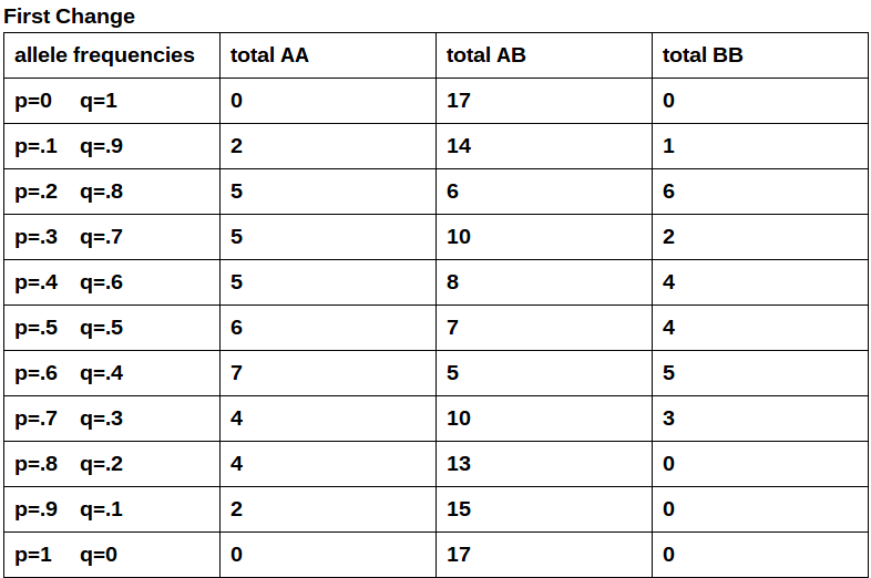
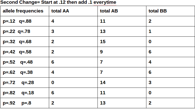
2. Make two separate tables that have 4 columns and 13 rows each. In the first column name it (allele frequencies). In the second column name it (total AA). In the third column name it (total AB). In the fourth column name it (total BB).
3.Now you are going to change the allele frequencies by changing p and q to the numbers that are listed in the first column below.
4. Then jot down the totals for AA, AB, BB. Then go on to your second change and do the same as step 3.
5.These tables represent the allele frequency changes in a population. You are going to use this spreadsheet and tables to help you answer the questions I answered. Hopefully my data helps.
How do inheritance patterns or allele frequencies change in a population over time?
They change in populations over time because they are the features that allow the animals to adapt to their environment. When their environment changes the animals have to change to live and be able to reproduce in the environment that they live in.
Guiding questions:
What can you change in your model?
I can change the allele frequencies so that the totals will vary.
If you change something in your model, what does the change tell you about how alleles behave?
If I change something in my model then the totals will react to the change. It is like a population. When your environment gets changed then you have to adapt and change to fit to your environment . That is how the alleles are acting. Changing to fit in their new environment.
Do alleles behave the same way if you make a particular variable more extreme? Less extreme?
No they don't behave the same way if you make a particular variable more extreme than less extreme. When the alleles are more extreme the dominant allele is higher than the low. Same with the recessive allele when it is high the dominant allele is lower.
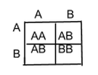
- Create a Punnett square for a graphical approach.
- Do alleles behave the same way no matter what the population size is? To answer this question you can insert rows of data .
- Assessment of your investigation: Create a formula that predicts the genotypes of the next generation.
- p^2+2pq+q^2=1
- Predict genotypes for the next generation using the H-W equation.
.12+2(.1)(.9)+.92=.01+.18+.81=1
- Answer the following questions with your formula
- In the absence of random events (an infinitely large population), are the allele frequencies of the original population expected to change from generation to generation?
Yes the allele frequencies of the original population are expected to change from generation to generation due to hardy weinberg's equilibrium. - How does this compare to a population that has random gamete selection but is small?
It is different because a large population is has many opportunities for evolution to happen and genetic drift to happen. A small population isn't big enough for those things to happen.There aren't a lot of the same species for that to happen. - What happens to allele frequencies in such a population? Is it predictable?
Since the population isn't diverse the population can't expand and there isn't much for it to do by adapting to the environment because the specie will tend to die off because there aren't enough of the same species to reproduce. - What factors can cause allele frequencies to change in a population? (There are many)
Genetic Drift, Gene Flow, Mutations, Nonrandom mating, and Natural Selection can all cause the allele frequencies to change in a population. - How could you model these factors using your spreadsheet?
- Try out different starting alleles frequencies in the model
- Describe the patterns that you find. Develop and use a pattern to select your values and to test and organize your exploration. Test extreme and intermediate values.
Conclusion: Discussion of Results/Errors:
Overall in this experiment I changed the allele frequencies and saw what each generation would look like. I saw if there was a change in the totals of the different individuals. I accomplished successfully writing my first lab write up and starting from scratch. I conducted a thorough experiment of how allele frequencies change over time in populations. I know understand biology to a greater extent. I now see how populations evolve and change over time. Some errors that occurred were during making my graphs and at the beginning with making the spreadsheets. I would say triple check when you are done making your spreadsheets to make sure you made it correctly. But other than these few mistakes my lab was fortunately successful. The hypothesis was proved incorrect. The frequencies didn't decrease dramatically. They either were leading into increase or they were either leading to a decrease. They didn't increase then decrease dramatically. They responded with a decrease then an increase or it was just a complete decrease.
Overall in this experiment I changed the allele frequencies and saw what each generation would look like. I saw if there was a change in the totals of the different individuals. I accomplished successfully writing my first lab write up and starting from scratch. I conducted a thorough experiment of how allele frequencies change over time in populations. I know understand biology to a greater extent. I now see how populations evolve and change over time. Some errors that occurred were during making my graphs and at the beginning with making the spreadsheets. I would say triple check when you are done making your spreadsheets to make sure you made it correctly. But other than these few mistakes my lab was fortunately successful. The hypothesis was proved incorrect. The frequencies didn't decrease dramatically. They either were leading into increase or they were either leading to a decrease. They didn't increase then decrease dramatically. They responded with a decrease then an increase or it was just a complete decrease.
Graph Justification:
I used a line graph for my data to compare changes over time. In the experiment the y values are always described as the amount of individuals over time. It always then has the x value as the frequency of either p or q that responds to the amount of individuals.
I used a line graph for my data to compare changes over time. In the experiment the y values are always described as the amount of individuals over time. It always then has the x value as the frequency of either p or q that responds to the amount of individuals.
Author
My name is Haley and I am an AP Bio Student.
Archives
March 2015
January 2015
November 2014
September 2014
 RSS Feed
